Trustpilot

Trends, truth and triggers

Trustpilot.com had done a huge meta-analysis of reviews on their website and wanted a landing page to show it off.

This meant lots of animations, interactivity, and high information density to explain their findings in a concise and engaging way.

React
lottie
Web design
Next.js
business.trustpilot.com/trends-financial-services/
The hero section from the Trustpilot report page
business.trustpilot.com/trends-financial-services/
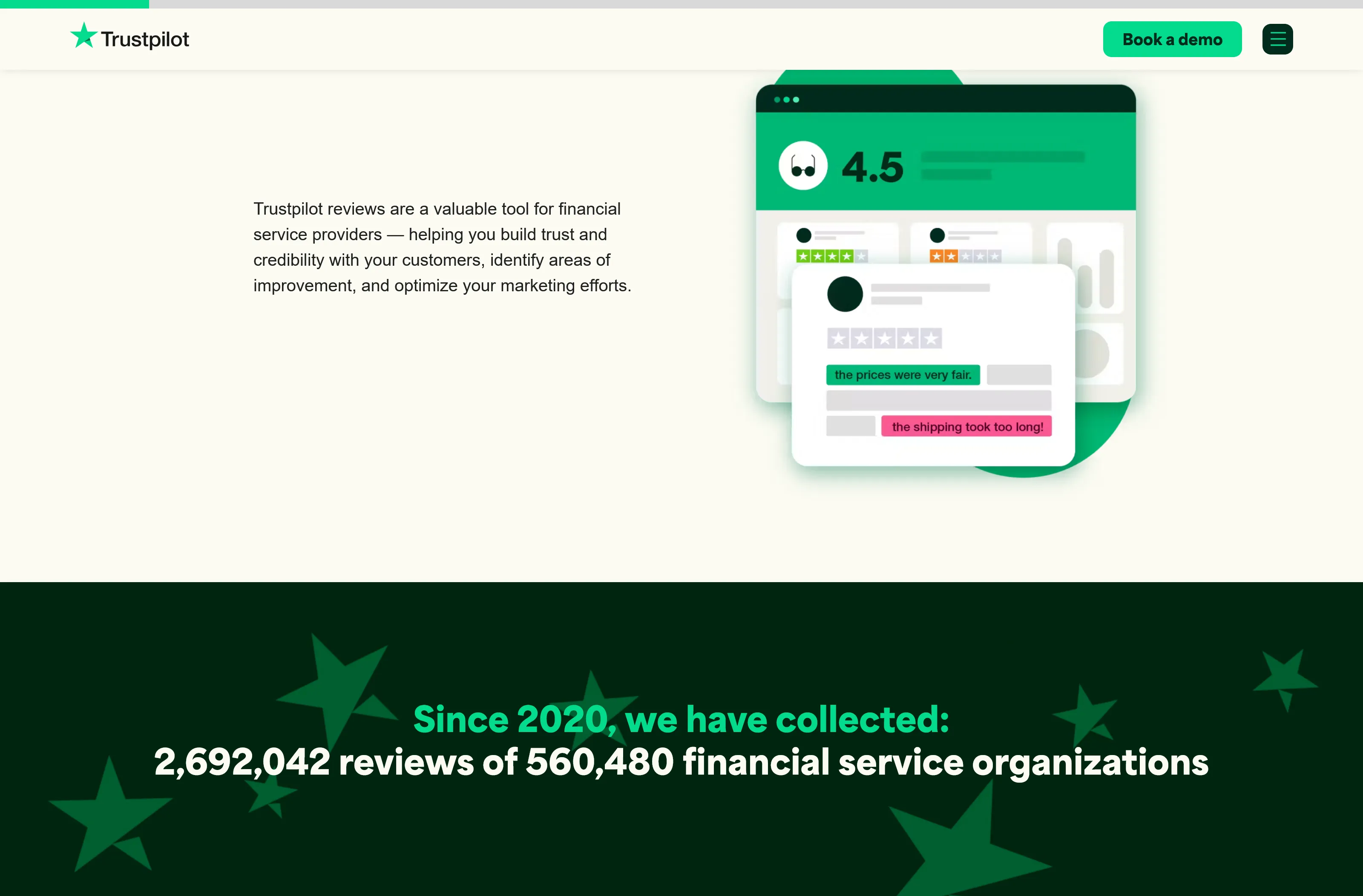
The main body of the report page

We used a few tricks to reduce bounce rates:

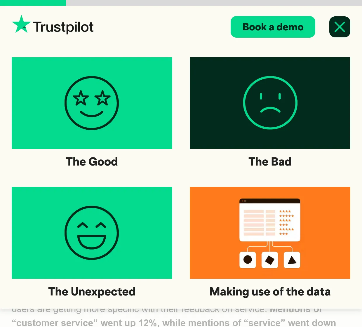
  1. Added section previews to the menu to tie the page together visually
  2. Used some animations from the client’s brand toolbox to quickly add a little eye-candy
  3. Broke up the text by adding supporting iconography where possible
The mobile menu design used on the page