Assisting the user through content
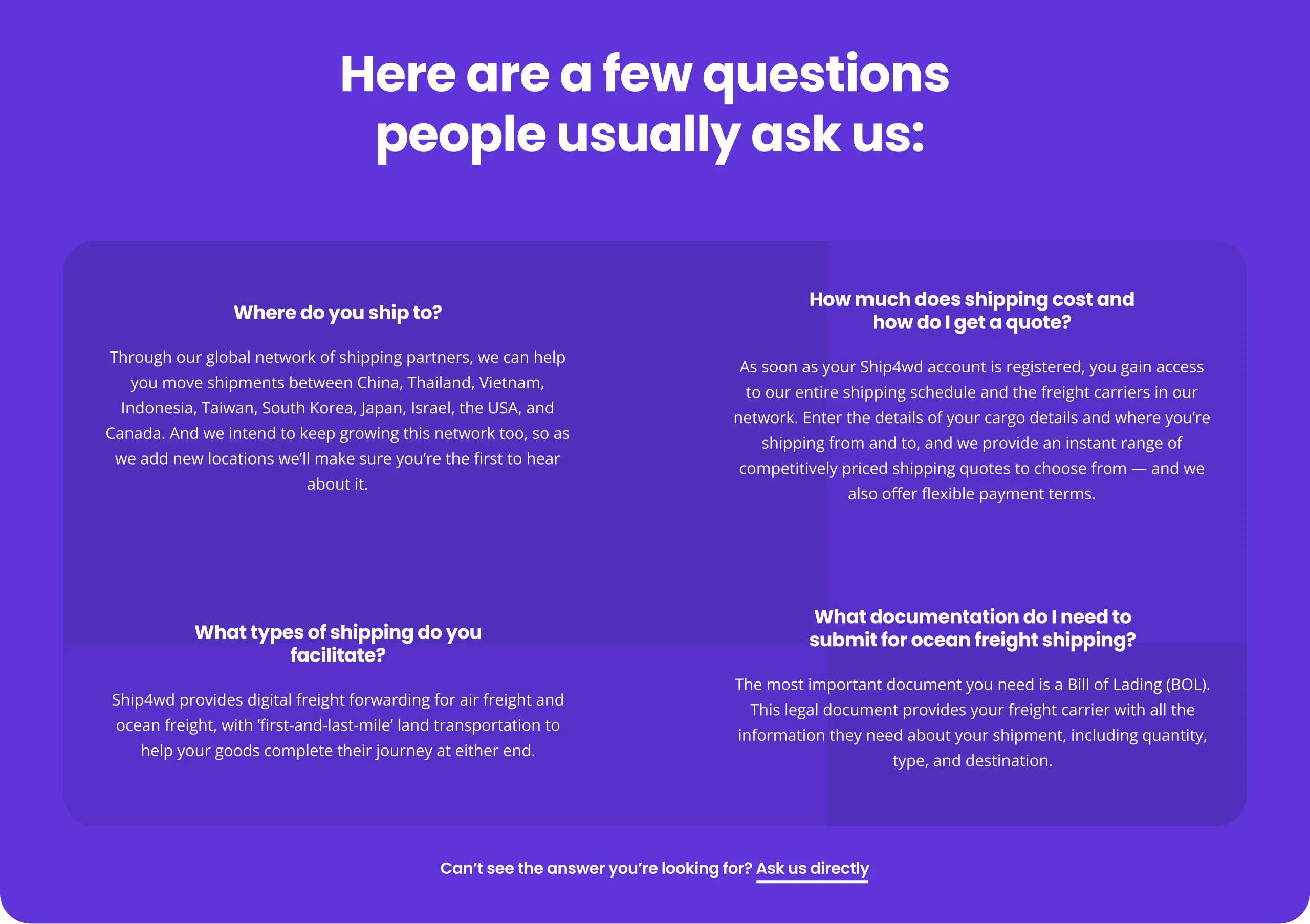
The bulk of Ship4wd’s customers were small businesses, and it was expected that the majority of these were
relatively new to the world of shipping — this meant that the design and website as a whole needed to be
more than just a promotional tool, it also needed to be an educational one.
This dual purpose was folded into their brand where they positioned themselves as helpful on a personal level as
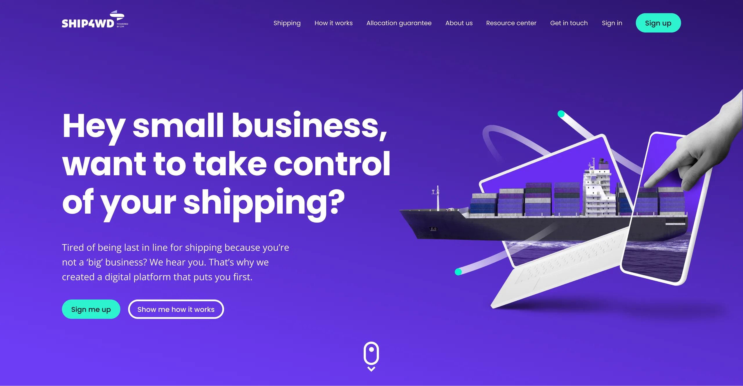
well as just a business partner, hence the literal “helping hands” throughout the site. As well as
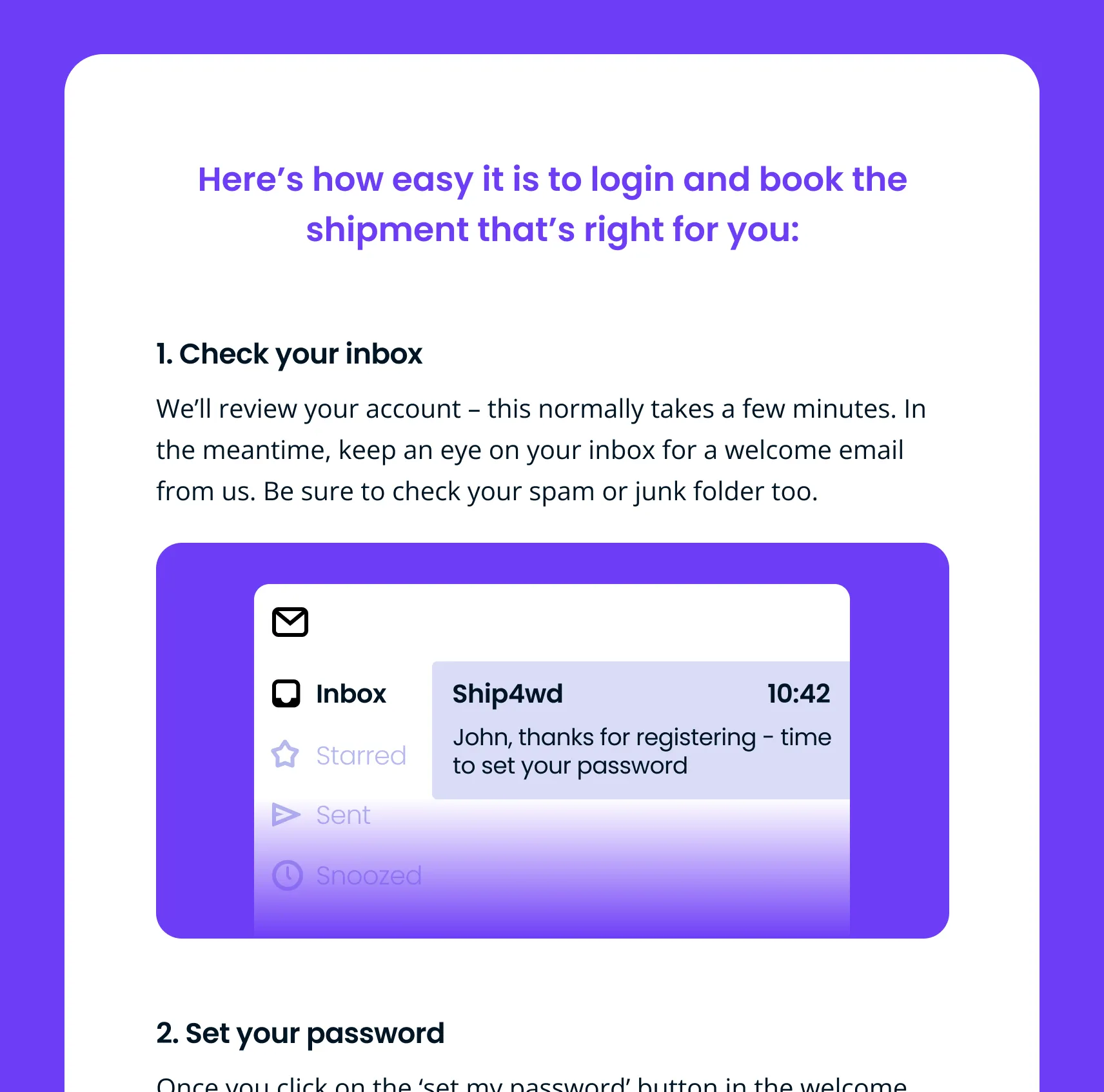
these visual elements, this core principle was reinforced by the copy, which was designed to be up-front and as
visually appealing as any graphics.

